One visualisation method I keep coming back too is the treemap. Each time I experiment with them I learn a little bit more, but I usually end up abandoning them (with the exception of using quantum treemaps to display bibliographic data). But they keep calling me back.
My latest experiment builds on some earlier thoughts on quantum treemaps, but tackles two issues that have kept bugging me. The first is that quantum treemaps are limited to hierarchies that are only two levels deep (e.g., family → genus → species). This is because, unlike regular treemaps where you are slicing and dicing a rectangle of predetermined size, when you construct a quantum treemap you don't know how big it will be until you've made it (this is because you want to ensure that every item in the hierarchy can be displayed at the same size, and fitting them in may require you to tweak the size of the treemap). Given that taxonomic classifications have > 2 levels this is a problem. One approach is to construct quantum treemaps for the lower parts of the classification, then pack those into a larger rectangle. This is an instance of the packing problem. After Googling for a bit I came up across this code for packing rectangles, which was easy to follow and gave reasonable results.
The second problem is that I want the treemap to be interactive. I want to be able to zoom in and out and navigate around the treemap. After more Googling, I came across the Zoomooz.js library which makes web page elements zoom (for a pretty mind-blowing example of what can be done see impress.js), but I decided I want to work with SVG. After playing with examples from Keith Wood's jQuery SVG plugin I started to get the hang of creating zoomable visualisations in SVG.
Here's a video of what I've come up with so far (you can see this live at http://iphylo.org/~rpage/zoomrect/primates.html). This is an interactive display of the Catalogue of Life 2010 classification of primates, with images from EOL. It's crude, there are some obvious issues with redrawing images, labels, etc., but it gives a sense of what can be done. With care this could probably be scaled up to handle the entire Catalogue of Life classification. With a bit more care, it could probably be optimised for the iPad, which would be a fun way to navigate through the diversity of life.
Showing posts with label treemap. Show all posts
Showing posts with label treemap. Show all posts
Mendeley Hack4Knowledge: towards an "ego wall"
I'm taking a virtual part in Mendeley's Hack4Knowledge event. I'm using this a chance to explore some ideas about building novel interfaces to bibliographic data in Mendeley. One idea is to display a user's entire library in one screen. I think the user interfaces employed by most bibliographic software are too conservative and there some cool things that could be done. For example, see A fluid treemap interface for personal digital libraries (doi:10.1145/1065385.1065512, PDF available from CiteSeer).
One idea I'm playing with is to display all a Mendeley user's papers as a quantum treemap, with thumbnails of the papers and "badges" indicating, for example, how many readers each paper has. The idea is that at a glance you can see all your publications, and which ones are being read the most. You can think of it as an "ego wall" — a quick way to see what others think about your work. Below is part of my library. You can see the full treemap here as an SVG file. Imagine this as an iPad interface to a user's Mendeley library.

Eventually I'll make this live. I'm doing this yet as the script to create the visualisation is slow due to the multiple requests I need to make to get the necessary information. I have to get the list of a user's papers from Mendeley, then I call the API for each paper to get basic bibliographic details. I have to screen scrape the corresponding paper's web page to get the thumbnail and the paper's UUID, which I can then use to get the readership stats via Mendeley's API via yet another API call. Sigh.
Anyway, this is enough hacking for one day. Hope to spend some more time on this project tomorrow.
One idea I'm playing with is to display all a Mendeley user's papers as a quantum treemap, with thumbnails of the papers and "badges" indicating, for example, how many readers each paper has. The idea is that at a glance you can see all your publications, and which ones are being read the most. You can think of it as an "ego wall" — a quick way to see what others think about your work. Below is part of my library. You can see the full treemap here as an SVG file. Imagine this as an iPad interface to a user's Mendeley library.

Eventually I'll make this live. I'm doing this yet as the script to create the visualisation is slow due to the multiple requests I need to make to get the necessary information. I have to get the list of a user's papers from Mendeley, then I call the API for each paper to get basic bibliographic details. I have to screen scrape the corresponding paper's web page to get the thumbnail and the paper's UUID, which I can then use to get the readership stats via Mendeley's API via yet another API call. Sigh.
Anyway, this is enough hacking for one day. Hope to spend some more time on this project tomorrow.
Quantum treemaps meet BHL and the Australian Faunal Directory
One of the things I'm enjoying about the Australian Faunal Directory on CouchDB is the chance to play with some ideas without worrying about breaking lots of code or, indeed, upsetting any users ('cos, let's face it, there aren't any). As a result, I can start to play with ideas that may one day find their way into other projects.
One of these ideas is to use quantum treemaps to display an author's publications. For example, below is a treemap showing publications by G A Boulenger in my Australian Faunal Directory on CouchDB project. The publications are clustered by journal. If a publication has been found in BioStor the treemap displays a thumbnail of that publication, otherwise it shows a white rectangle. At a glance we can see where the gaps are. You can view a publication's details simply by clicking on it.

The entomologist W L Distant has a more impressive treemap, and clearly I need to find quite a few of his publications.

I quite like the look of these, so may think about adding this display to BioStor. I may also think about using treemaps in my ongoing iPad projects. If you want to see where I'm going with this then take a look at Good et al. A fluid treemap interface for personal digital libraries.
Notes
The quantum treemap is computed using some rather ugly PHP I wrote, based on this Java code. I've not implemented all the refinements of the original Java code, so the quantum treemaps I create are sometimes suboptimal. To avoid too much visual cluster I haven't drawn a border around each cell, instead I use CSS gradients to indicate the area of the cell (if you're using Internet Explorer the gradient will be vertical rather than going from top left to bottom right). The journal name is overlain on the cell contents, but if you are using a decent browser (i.e., not Internet Explorer) you can still click through this text to the underlying thumbnail because the text uses the CSS property
I learnt this trick from the Stack Overflow question Click through div with an alpha channel.
One of these ideas is to use quantum treemaps to display an author's publications. For example, below is a treemap showing publications by G A Boulenger in my Australian Faunal Directory on CouchDB project. The publications are clustered by journal. If a publication has been found in BioStor the treemap displays a thumbnail of that publication, otherwise it shows a white rectangle. At a glance we can see where the gaps are. You can view a publication's details simply by clicking on it.
The entomologist W L Distant has a more impressive treemap, and clearly I need to find quite a few of his publications.
I quite like the look of these, so may think about adding this display to BioStor. I may also think about using treemaps in my ongoing iPad projects. If you want to see where I'm going with this then take a look at Good et al. A fluid treemap interface for personal digital libraries.
Notes
The quantum treemap is computed using some rather ugly PHP I wrote, based on this Java code. I've not implemented all the refinements of the original Java code, so the quantum treemaps I create are sometimes suboptimal. To avoid too much visual cluster I haven't drawn a border around each cell, instead I use CSS gradients to indicate the area of the cell (if you're using Internet Explorer the gradient will be vertical rather than going from top left to bottom right). The journal name is overlain on the cell contents, but if you are using a decent browser (i.e., not Internet Explorer) you can still click through this text to the underlying thumbnail because the text uses the CSS property
.overlay { pointer-events: none; }I learnt this trick from the Stack Overflow question Click through div with an alpha channel.
Viewing scientific articles on the iPad: browsing articles
 In previous articles I've looked at how various apps display scientific articles. The apps I looked at were:
So, where next? As Ian Mulvany noted in a comment on an earlier post, I haven't attempted to summarise the best user interface metaphors for navigation. Rather than try and do that in the abstract, I'd like to create some prototypes to play with various ideas. The Sencha Touch framework looks a good place to start. It's web-based, so things can be prototyped rapidly (I'm not going to learn Objective C anytime soon). There's a moderately steep learning curve, unless you've written a lot of Javascript (I've done some, but not a lot), but it seems to offer a lot of functionality. Another advantage of developing a web app is that it keeps the focus on making the content accessible across devices, and using the web as the means to display and interact with content.
Then there is also the issue (in addition to displaying an individual article) of how to browse and find articles to view. Here are some possibilities.
Publisher's stream
Apps such as the Nature app and the PLos Reader provide you with a stream of articles from a single publisher. This is obviously a bit limiting for the reader, but might have some advantages if the publisher has specifically enhanced their content for devices such as the iPad.
Personal library
Apps such as Mendeley and Papers provide articles from your personal library. These are papers you care about, and one you may make active use of.
Social
Social readers such as Flipboard show the power of bringing together in one place content derived from social streams, such as Twitter and Facebook, as well as curated sources and publisher streams. Mendeley and other social bookmarking services (e.g., CiteULike, Connotea) could be used to provide social similar streams of papers for an article viewer. Here the goal is probably to find out what papers people you know find interesting.
Spatial

In an earlier post I used a map to explore papers in my BioStor archive. This would be an obvious thing to add to an iPad app, especially as the iPad knows where you are. Hence, you could imagine browsing papers about areas that are near you, or perhaps by authors near you. This would be useful if, say, you wanted to know about ecological or health studies of the area you live in. If the geographic search was for people rather than papers, you could easily discovering what kind of research is published by universities or other research bodies that are near your current location.
Of course, Earth is not the only thing we can explore spatially. Google maps can display other bodies in the solar system, (e.g., Mars), as well as the night sky. Imagine being interested in astronomy and being able to browse papers about specific planetary or stellar objects. Likewise, genomes can be browsed using Google maps-inspired browsers (e.g., jBrowse), so we could have an app where you could easily retrieve articles about a particular gene or other region of a genome.
Categories
Another way to browse content is by topic. Classifying knowledge into categories is somewhat fraught, but there are some obvious wasy this could be useful. A biologist might want to navigate content by taxonomic group, particularly if they want to browse through the 1000's of articles published in a journal such as Zootaxa (hence my experiments on browsing EOL). Of course, a tree is not the only way to navigate hierarchical content. Treemaps are another example, and I've played with various versions in the past (see here and here).
I have a love-hate relationship with treemaps, but some of the most interesting work I've seen on treemaps has been motivated by displaying information on small screens, e.g. "Using treemaps to visualize threaded discussion forums on PDAs" (doi:10.1145/1056808.1056915).
Summary
These notes list some of the more obvious ways to browse a collection of articles. It would be fun to explore these (and other approaches) in parallel with thinking about how to display the actual articles. These two issues are related, in the sense that the more metadata we can extract from the articles (such as keywords, taxonomic names and other named entities, geographic localities, etc.) the richer the possibilities for finding our way through those articles.
Mashing up NCBI and Wikipedia using treemaps
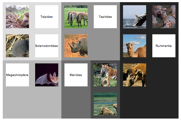
Having made a first stab at mapping NCBI taxa to Wikipedia, I thought it might be fun to see what could be done with it. I've always wanted to get quantum treemaps working (quantum treemaps ensure that the cells in the treemap are all the same size, see my 2006[!] blog post for further description and links). After some fussing I have some code that seems to do the trick. As an example, here is a quantum treemap for Laurasiatheria.
The diagram shows the NCBI taxonomy subtree rooted on Laurasiatheria, with images (where available) from Wikipedia for the children of the the children of that node. In other words, the images correspond to the tips of the tree below:

There's a lot to be done to tidy this up, but there is potential to create a nice, visual way to navigate through the NCBI taxonomy (it might work well on the iPhone or iPad, for example).
The diagram shows the NCBI taxonomy subtree rooted on Laurasiatheria, with images (where available) from Wikipedia for the children of the the children of that node. In other words, the images correspond to the tips of the tree below:
There's a lot to be done to tidy this up, but there is potential to create a nice, visual way to navigate through the NCBI taxonomy (it might work well on the iPhone or iPad, for example).
Displaying taxonomic coverage using a treemap
A quick, and not altogether satisfactory hack, but I've added a simple interactive treemap to BioStor. It's essentially a remake of the Catalogue of Life treemap I created in 2008, but coloured by the number of references I've extracted from BHL. I wanted a quick way to visualise which groups were well represented (darker colours), and which weren't (lighter colours). For example, in the diagram below we can see that Annelida, Arthropoda, Chordata, Cnidaria, and Mollusca have most of the references.

The treemap at BioStor is interactive. You can click on a panel in the treemap to drill down. To go back up, click on the desired level in the tree displayed to the left of the treemap.
The treemap at BioStor is interactive. You can click on a panel in the treemap to drill down. To go back up, click on the desired level in the tree displayed to the left of the treemap.
Subscribe to:
Posts
(
Atom
)