Search this keyword

Showing posts with label github. Show all posts

Using orthographic projections to map organism distributions

For a current project I'm currently working I show organism distributions using data from GBIF, and I display that data on a map that uses the equirectangular projection. I've recently started to create a series of base maps using the GBIF colour scheme, which is simple but effective:

  • #666698 for the sea
  • #003333 for the land
  • #006600 for borders
  • yellow for localities


The distribution map is created by overlaying points on a bitmap background using SVG (see SVG specimen maps from SPARQL results for details). SVG is ideally suited to this because you can take the points, plot them in the x,y plane (where x is longitude and y is latitude) then use SVG transformations to move them to the proper place on the map.

For the base maps themselves I've also started to use SVG, partly because it's possible to edit them with a text editor (for example if you want to change the colours). I then use Inkscape to export the SVG to a PNG to use on the web site.

Gbif360x180

One thing that has bothered me about the equirectangular projection is that, although it is familiar and easy to work with, it gives a distorted view of the world:


This is particularly evident for organisms that have a circumpolar distribution. For example, Kerguelen's petrel Aphrodroma has a distribution that looks like this using the equirectangular projection:

A1

This long, thin distribution looks rather different if we display it on a polar projection:
A2

Likewise, classic Gondwanic distributions such as that of Gripopterygidae become clearer on a polar projection.
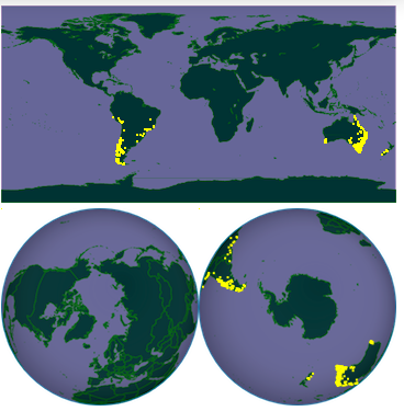
g

Computing the polar coordinates for a set of localities is straightforward (see for example this page) and using SVG to lay out the points also helps, because it's trivial to rotate them so that they match the orientation of the map. Ultimately it would be nice to have an embedded, rotatable 3D globe (like the Google Earth plugin, or a Javascript+SVG approach like this). But for now I think it's nice to have the option of using different projections available to help display distributions more faithfully.

The bitmap maps and their SVG sources are available on github.

Where is the "crowd" in crowdsourcing? Mapping EOL Flickr photos

In any discussion of data gathering or data cleaning the term "crowdsourcing" inevitably comes up. A example where this approach has been successful is the Encyclopedia of Life's Flickr pool, where Flickr users upload images that are harvested by EOL.

Given that many Flickr photos are taken with cameras that have built-in GPS (such as the iPhone, the most common camera on Flickr) we could potentially use the Flickr photos not only as a source of images of living things, but to supplement existing distributional data. For example, Flickr has enough data to fairly accurately construct outlines of countries, cities, and neighbourhoods, see The Shape of Alpha, so what about organismal distribution?

This question is part of a Masters project by Jonathan McLatchie here at Glasgow, comparing distributions of taxa in GBIF with those based on Flickr photos. As part of that project the question arose "where are the Flickr photos being taken?" If most of the photos are being taken in the developed world, then there are at least two problems. The first is the obvious bias against organisms that live elsewhere (i.e., typically many photos won't be taken in those regions where you'd actually like to get more data). Secondly, the presence of zoos, wildlife parks, and botanical gardens means you are likely to get images of organisms well outside their natural range.

Jonathan suggested a "heatmap" of the Flickr photos would help, so to create this I wrote a script to grab metadata for the photos from the Encyclopedia of Life's Flickr pool, extract latitude and longitude, and draw the resulting locations on a map. I aggregated the points into 1°×1° squares, and generated a GBIF-style map of the photos:

Screenshot

Lots of photos from North America, Europe, and Australasia, as one might expect. Coverage of the rest of the globe is somewhat patchy. I guess the key question to ask is extent the "crowd" (Flickr users in this case) is essentially replicating the sampling biases already in projects like GBIF that are aggregating data from museum collections (most of which are in the developed world).

The PHP code to fetch the photo data and create the map is available in github. You'll need a Flickr API key to run the script. The github repository has an SVG version of the map (with a bitmap background). A bitmap copy of the map is available on FigShare http://dx.doi.org/10.6084/m9.figshare.92668.

BLAST a sequence and get a tree

For this weeks sessions of my phyloinformatics course I'm developing some phylogeny tools. The first is a simple AJAX-based BLAST tool. I've always wanted a quick way to see a GenBank sequence in its phylogenetic context, so I've built a simple tool to that takes a GenBank accession number or GI number, submits a BLAST job, retrieves the sequences, aligns them using CLUSTALW, builds a quick and dirty neighbour-joining tree using PAUP*, then displays the tree using SVG (if your browser doesn't support this you won't see the tree). One use for this is to quikcly get a sense of whether an unnamed ("dark") taxon is related to sequences that have been identified.

Nothing fancy, but it was a chance to display the whole process in the browser without opening new windows or refreshing the page. Here's an example for the GenBank sequence FJ559186:


For the technically-minded, the calls to BLAST and the alignment and tree construction tools all use AJAX, and there's a simple Javascript timer to countdown the seconds that the NCBI BLAST web service estimates the BLAST job will take, before we poll NCBI to see if the job has in fact finished. The code is in GitHub.

Open course on phyloinformatics

As part of a postgraduate course here at the University of Glasgow I'm teaching five sessions on "phyloinformatics", which I've decided to define broadly enough to encompass most of biodiversity informatics.

Given that this module is being developed on the fly, and will make use of lots of little "toys" I've developed and discussed on this blog, I've decided to put the course notes online, along with the interactive demos and the source code. So, if you want to follow along for the next couple of weeks, here are the links:


Each course page supports comments (see the bottom of the page), so feel free to add comments, or suggestions. The notes are at a crude stage, and will be developed over the duration of the course (2 weeks). I'm also endeavouring to get all the source code for the demonstration apps into GitHub. None of these demos is polished, but they will hopefully provide some ideas for taking them further. There will be iSpecies-like mashups, iPad webapps, classification visualisations, TreeBASE search tools, geophylogenies and other phylogeny viewers.

Wikipedia History Flow tool now in GitHub

Inspired by a comment on my post Visualising edit history of a Wikipedia page, the code I use to make history flow diagrams like the one below is now in GitHub at https://github.com/rdmpage/wikihistoryflow.

Historyflow

There is also a live version at http://iphylo.org/~rpage/wikihistoryflow. If you enter the name of a Wikipedia page the tool will display the edit history with columns representing page versions and individual contributors (people and bots) distinguished by different colours.

This tool will fall over for pages with a lengthy history of edits, and requires a web browser that can support SVG, but it's a fun visualisation, and may inspire someone to do this properly.

Nature iPhone app clone in GitHub

One thing I'm increasingly conscious of is that I've a lot of demos and toy projects hanging around and the code for most of these isn't readily available. So, I plan to clean these up and put them in GitHub so others can explore the code, and reuse it if they see fit.

First up is the code to create a HTML+Javascript clone of Nature's iPhone app, as described in an earlier post.

photo.PNGphoto.PNG


There's a live version of the clone here here. and the code is now available from GitHub at https://github.com/rdmpage/natureiphone.